
Amsterdam office rental App
I was brought onboard to design an app for renting office spaces around the city of Amsterdam. This was an exciting opportunity to utilize and help refine my UX / UI skills.
Together with the team we developed the brand language, the structure and logic of the app itself and I was trusted with the illustrations. We worked closely in a small team of stakeholders and I was thrilled to be able to communicate my ideas and reasoning in a collaborative and constructive way. The design of the app took a long time, from initial hand drawn wireframes to building a fully functional prototype on Figma. A truly great experience.


Brief / Challenge
I was brought on to design a mobile app for renting office spaces across Amsterdam — not just to build something functional, but to craft a very human, intuitive, and visually rich experience. The challenge was two-fold: make the app feel trusted and professional for business users, while also injecting little moments of delight through illustration and thoughtful design. On top of that, the structure needed to support a variety of use cases: browsing spaces, filtering by location, price or amenities, and eventually booking or inquiring — all in a way that felt smooth and logical.
Role
At Érimón Studios, I led the full UI/UX design process, from hand-drawn wireframes to a polished, interactive Figma prototype. I also designed the brand language for the app and created custom illustrations that bring the app’s personality to life. In doing so, I worked closely with a small cross-functional team of stakeholders and decision-makers — collaborating, iterating, and integrating feedback seamlessly.
Process
Early Wireframing & User Flows
I began with hand-drawn wireframes, mapping out how users would navigate through listing spaces, applying filters, viewing details, and eventually making contact or booking.
These wireframes helped clarify the information architecture: what screens were needed, what interactions were most important, and where illustrations could help guide the experience.Brand Language & Visual Style
We developed a visual identity for the app: a clean, modern color palette inspired by Amsterdam’s architecture and its creative energy, combined with typography that felt professional but friendly.
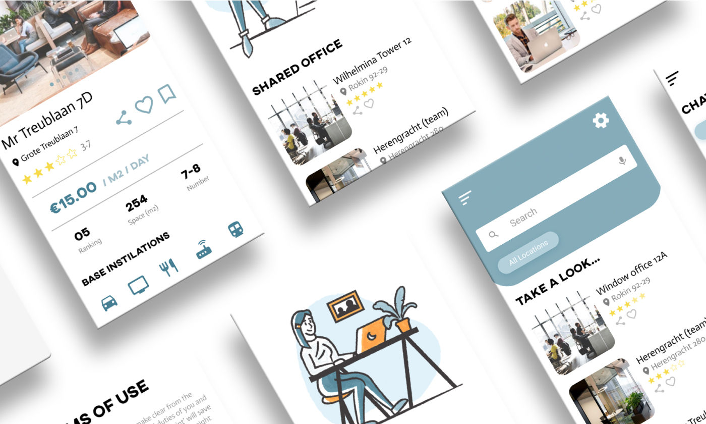
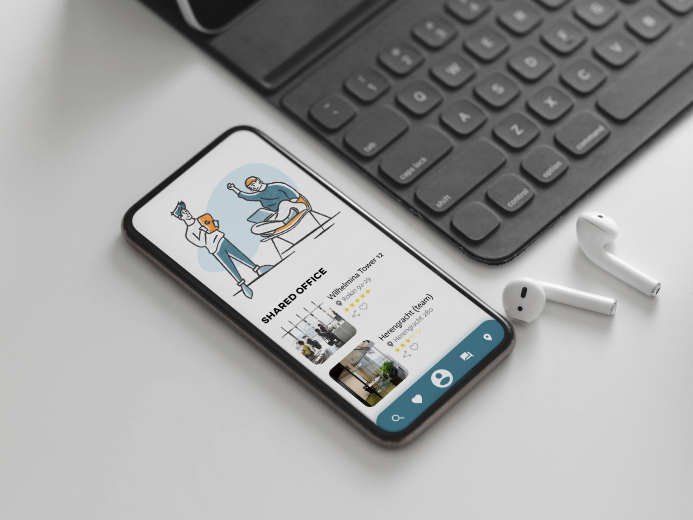
The illustrations were a core part of the identity: custom-drawn scenes of office interiors, people at work, and Amsterdam landmarks. These visuals help make the app feel less transactional and more like part of a creative ecosystem.High-Fidelity Design & Prototype
Using Figma, I translated wireframes into detailed screens: home, search, filters, listing detail, booking/contact, onboarding, and profile.
Each screen is designed with clarity and usability in mind: easy navigation, clear calls-to-action, and a visual hierarchy that keeps the most important information front and center.
I built a fully clickable prototype so stakeholders could experience the flow and test interactions before development.Illustration Integration
The custom illustrations act as more than decoration — they help guide users, lighten potentially dry moments (like form-filling), and give the app a memorable character.
I used a consistent illustration style throughout, making sure icons, characters, and scenes all feel coherent and aligned with the overall brand.Collaboration & Iteration
Throughout the process, I ran design reviews with the team. Feedback shaped refinements in navigation, micro-interactions, and visual tone.
Revisions were rapid yet thoughtful: each iteration made the app more intuitive, more friendly, and more aligned with the business goals.
Solution / Outcome
The final app design is clean and professional but softly human — a real balance between utility and personality. Users can smoothly browse and filter office spaces in Amsterdam, dive into detailed views, and feel confident reaching out or booking. The illustration system gives the app a friendly edge: it’s not just a listing platform, but a place that feels part of the city’s creative fabric.
The Figma prototype captures the flow clearly, and the visual language (typography, color, icons) supports scalability: as the app grows, new features can be added without breaking the design system.
Impact (Design-Led)
Stakeholders reported that the prototype helped align their vision for both the business and the user experience — it felt tangible and real, rather than hypothetical.
The illustration-led brand identity makes the app feel unique in the real-estate / prop-tech space: it’s not just about buildings and rents, but about experience, place, and community.
With a clear UX structure and visual system, the development team has a strong foundation to actually build the app — speeding up their build process and reducing ambiguity.
Lessons Learned & Best Practices
Start with hand-drawn wireframes: they help you test major flows fast and cheaply before committing to high-fidelity design.
Illustrations should serve function, not just style: in this app, they guide users and make the experience warmer.
Iterate with stakeholders: early feedback is crucial, especially when balancing business logic with user experience.
Build a scalable design system: define your UI elements, typography, and brand language in a way that makes future growth easy.
Prototype early and often: a working Figma prototype helps everyone — designers, developers, stakeholders — understand how the app will feel.