CoffeePup
I was challenged with designing the logo and packaging for this coffee brand. The logo works on many levels and I adore a concept that accommodates for that.
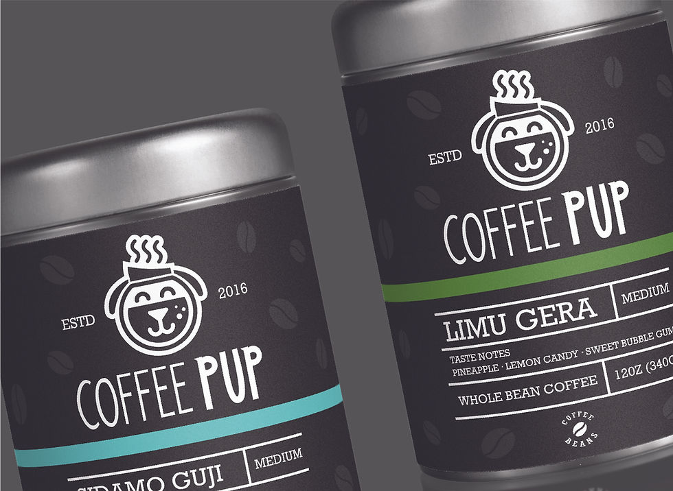
I wanted to use the coffee pot as the head with the handle duplicated at the other side to serve as the ears. I didn’t see a lot of coffee brands using playful and upbeat logos when doing my research. They were quite elegant and bougie. I wanted to play against that trope and come up with something welcoming and light hearted. The package design was especially fun for me. I wanted to avoid going too busy with it and contrast the joyful logo with a simple presentation of flavours and ingredients.


Brief / Challenge
Coffeepup came to me with a fun, yet serious ambition: to launch a coffee shop that blends warmth and playfulness with quality and craftsmanship. They needed a full brand identity — not just a logo, but a real visual personality — one that could work across the café space, packaging, and all touchpoints. The challenge was to find a name, identity, and design system that felt charming and accessible, yet grounded in coffee culture, so the brand would appeal to both casual coffee drinkers and aficionados.
Role
As lead designer at Érimón Studios, I handled the entire identity build: naming, logo design, brand visuals, and packaging. I developed the core brand strategy, crafted a visual system, and created tangible assets like coffee bags, takeaway cups, and in-store collateral that reflect Coffeepup’s playful but dependable spirit.
Process
Strategy & Naming
I worked closely with Coffeepup’s founders to understand their vision and target audience.
Through brainstorming and refinement, we settled on the name “Coffeepup”, which captures the idea of an energetic, friendly space — the “pup” evokes warmth, loyalty, and joy, while “coffee” grounds it in a serious, craft-driven experience.Visual Exploration & Mood-boarding
I pulled together mood boards drawing on playful animal motifs, soft graphic patterns, and warm coffee tones. I explored a variety of visual directions: minimal and modern, illustrative and character-led, and typographic-driven identities.Logo Design & Iteration
Several logo concepts were sketched: a pup silhouette with a coffee cup, abstract marks combining paw shapes and coffee beans, and wordmarks with warm, rounded letterforms.
Through feedback and refinement, I landed on a logo that balances simplicity with charm: a stylised, friendly pup icon that can stand on its own or pair with custom type.Color, Typography & Visual System
I chose a color palette rooted in earthy coffee tones — rich browns, creamy beiges — and added accent hues (perhaps a soft pastel or muted green) to convey friendliness and freshness.
Typography choices lean into warmth and clarity: a clean but slightly rounded sans serif for readability, paired with a secondary font for playful personality on menus and packaging.Packaging & Collateral Design
I designed packaging for coffee bags: the pup icon appears in a pattern, or as a badge, depending on roast or variety.
For takeaway cups, labels, and in-store items, I created flexible graphic elements — icons, patterns, and brand marks — that carry “Coffeepup” everywhere the brand touches.
I also mocked up in-store collateral (menu boards, signage) that feel cohesive with the packaging design and visual tone.Brand Guidelines & Application
I produced a simple brand style guide to help Coffeepup maintain consistency: how to use the logo, colour combinations, typography rules, and packaging layout.
I provided adaptable assets so the brand can grow — adding new coffee roasts, seasonal products, or merchandise without breaking the visual system.
Solution / Outcome
The final identity for Coffeepup is warm, approachable, and instantly memorable. The pup icon becomes a friend to customers — a visual shorthand for the brand’s friendly, open spirit. The color palette and typography strike a balance between artisanal coffee tradition and playful accessibility. Across packaging and café materials, the design system feels unified: whether you’re grabbing a bag of beans, sipping a latte, or just hanging out in-store, the brand feels thoughtful and inviting.
Impact (Design-Led)
Coffeepup now has a strong, flexible visual identity that works in physical space and on product packaging.
The name and branding help the café feel unique in a competitive market — something that’s not just “another coffee shop,” but a place with personality.
The packaging design encourages brand recognition: customers see that pup icon and immediately think of Coffeepup.
With a clear style guide, the Coffeepup team can confidently expand — whether adding new coffees, merchandise, or marketing materials — and keep everything looking cohesive.
Lessons Learned & Best Practices
Naming is identity: A playful, clever name like “Coffeepup” sets tone and expectation from the very start.
Icon + type versatility: Having a friendly symbol and clean wordmark gives flexibility across different media.
Balance personality and clarity: Charm is great, but only when paired with legibility and structured design, especially for packaging.
Consistency matters: A clear brand system ensures that even when new items are added, the brand feels unified.
Design for scale: Creating adaptable graphic elements (icons, patterns) means you can grow without redesigning every piece.