
HCMS - Branding and Illustrations
I was hired by a web design agency to work with them on the branding and design language of a website they were building for HCMS.
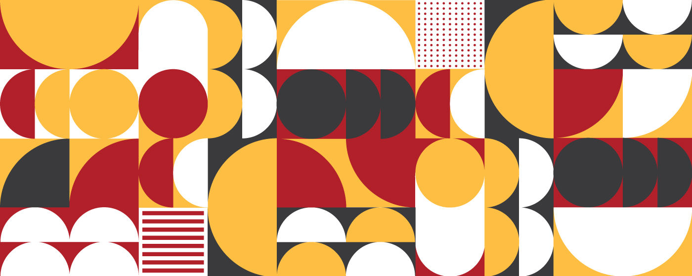
We worked closely together on updating the logo, establishing the colour scheme and developing the unique geometric style that would define the brand and have it stand strong. This style would be used for marketing materials (physical and digital) icons, communication and illustrations. I had a great time developing the different ‘rules’ and ‘codes’ for the design language and we were all very enthusiastic with how it ended up.


Brief / Challenge
HCMS is a recruitment company specialising in matching businesses with top HR talent. They wanted a brand identity that reflected professionalism, trust, and approachability, while also standing out in a competitive recruitment market. The client provided examples and mood boards as a starting point, but the challenge was to translate their vision into a cohesive, flexible brand that could work across digital and print channels.
Role
As lead designer at Érimón Studios, I delivered:
A full brand identity (logo, colour palette, typography)
Illustrative assets to enhance visual storytelling
Templates and brand elements for marketing and recruitment communications
I worked closely with HCMS to refine the identity, ensuring alignment with their vision and the target audience.
Process
Discovery & Moodboard Analysis
I started by reviewing the client’s provided examples and mood boards, identifying the key visual cues they wanted to carry through: professional, approachable, and modern, with a hint of playfulness to make HR recruitment feel more human and accessible.
Logo Development
Multiple logo directions were explored, ranging from clean typographic marks to symbol-driven concepts. The goal was to create a logo that communicated reliability and trustworthiness, while also feeling personable. Iterative feedback refined the mark into a balanced, memorable logo suitable for both digital and print applications.
Colour Palette & Typography
I developed a color system that balances professionalism with approachability. A palette of calming, neutral base colours was complemented by subtle accent tones to bring warmth and character to the brand. Typography choices focused on clarity and legibility, while reinforcing a modern, professional tone.
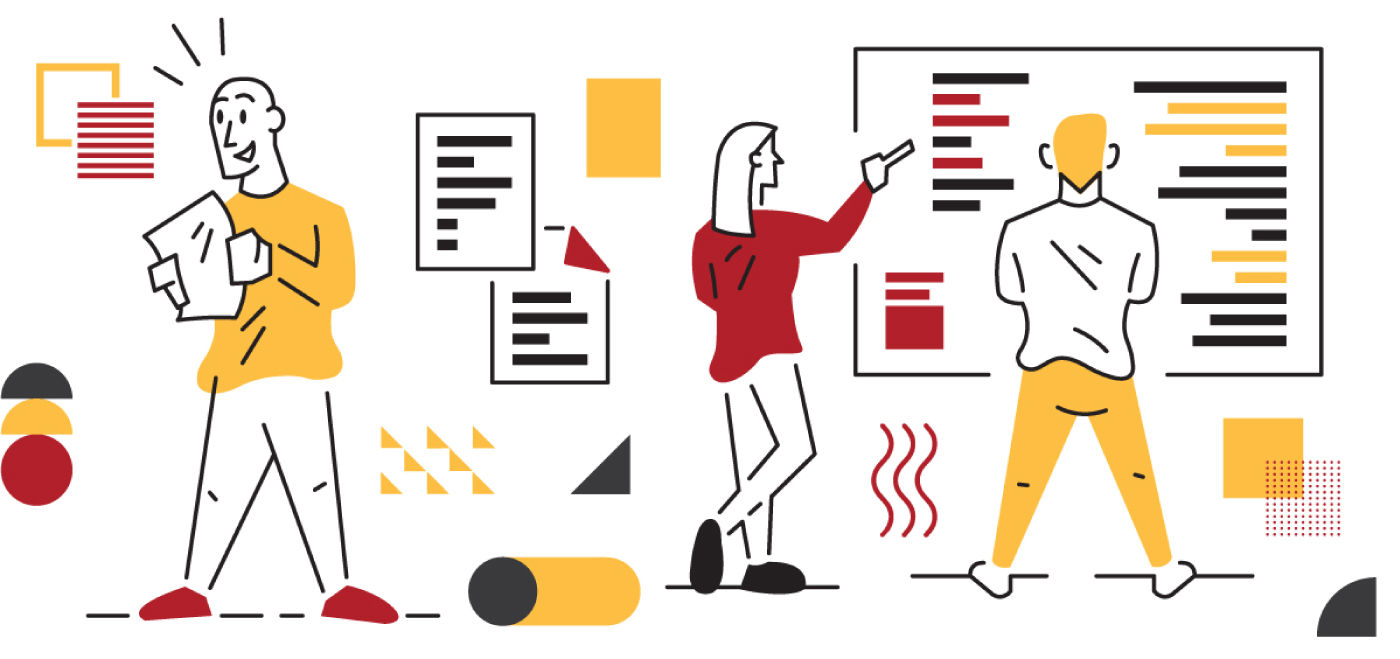
Illustration & Visual Language
To differentiate HCMS in the recruitment space, I created a series of illustrations that depict HR processes, teamwork, and people in a stylised, friendly manner. These assets bring personality to the brand while keeping it professional. Illustrations were designed to work across the website, presentations, and marketing materials.
Feedback & Refinement
Through iterative reviews, the brand identity and illustrations were refined to ensure they matched the client’s expectations, balanced approachability with professionalism, and could be applied consistently across channels.
Solution / Outcome
The final brand identity for HCMS is modern, professional, and approachable. The logo communicates trust while remaining memorable. The colour palette and typography establish clarity and consistency across touchpoints. Illustrations add personality and help HCMS visually communicate their services and values, making HR recruitment feel more engaging and human.
Impact (Design-Led)
HCMS now presents a cohesive, professional identity that resonates with both companies seeking HR talent and prospective candidates.
Illustrations and visual assets make marketing materials more engaging, helping the brand stand out in a competitive recruitment landscape.
The identity system provides flexibility for future marketing campaigns, digital communications, and printed collateral.
Stakeholders reported a stronger visual presence and clearer brand recognition, making the company feel more approachable and credible.
Lessons Learned & Best Practices
Start with the client’s vision: Mood boards and examples provide an invaluable foundation to guide design decisions.
Balance professionalism with personality: Especially in HR, brands must feel trustworthy but human.
Illustrations enhance storytelling: Custom assets give a brand character and help explain abstract services in a relatable way.
Iterate closely with stakeholders: Regular feedback ensures the final identity aligns with client expectations while elevating the brand.